How to make a flicker-free dark theme toggle with Next.js, TailwindCSS, and next-themes
Here's how to build a dark/light theme toggle in Next.js using TailwindCSS and the next-themes npm package to make it load and transition flicker-free

Fullstack Developer | Technical Writer | Freelancer 👩💻
Posts about Web Dev, Tech, and Entrepreneurship 📈
Have you ever added a theme toggle to a website? Have you also tried to remember the user's preference so they see the same theme when they visit again?
Yes? Then my final question is, have you ever been greeted by a flash of the wrong theme on page load before switching to the correct theme after a few seconds?
Well, in this blog post I'm going to show you how to resolve just that. Today, we're going to add a dark/light theme toggle to a Next.js application using TailwindCSS with no theme flickering at all. 🙌
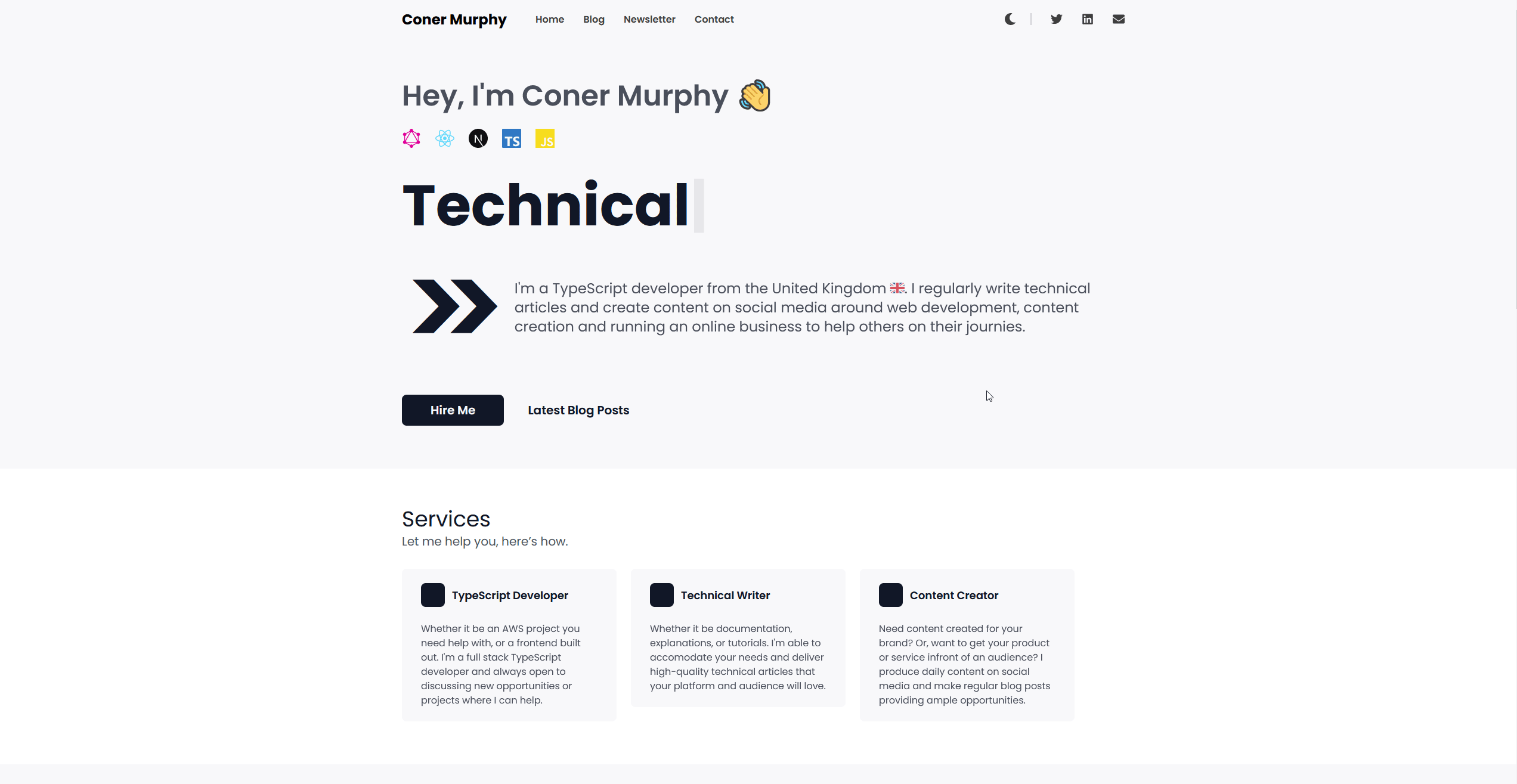
Here is an example of what we will be creating from my website.
Next.js and TailwindCSS initial setup
To follow along in this tutorial you will already need to have a Next.js application up and running, if you don't you can follow the Next.js documentation here. I will be using TypeScript in my project but you don't have to, this tutorial will work absolutely fine with standard JavaScript.
Once you have your Next.js application up and running we need to install TailwindCSS. Tailwind has a great guide for this on their website.
Now with your Next.js application working and TailwindCSS installed, we're ready to get started.
Home page setup
For this tutorial we are going to be showcasing a basic home page design that switches colors based on the theme we are in. Once, we're finished it will look something like this.
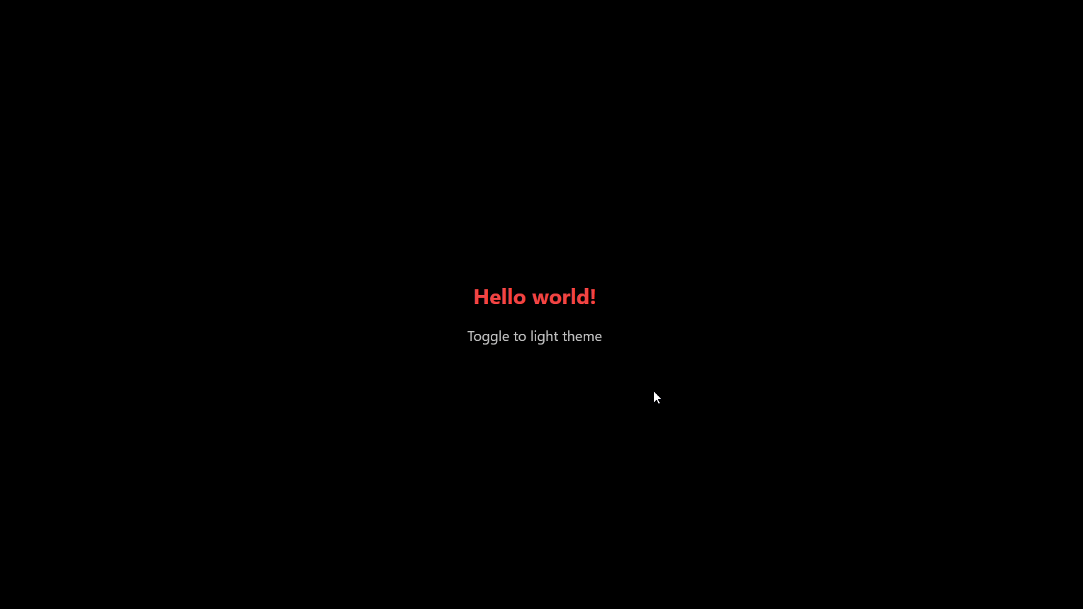
If you wish you can create a more detailed home page to switch between light and dark themes but the premise of toggling themes will remain the same. So, for this tutorial, a simple example page will suffice.
To get started, replace the contents of ./pages/index.tsx (TS) or ./pages/index.jsx (JS) with the code below.
import type { NextPage } from "next";
import Head from "next/head";

const Home: NextPage = () => {
  return (
    <div>
      <Head>
        <title>Create Next App</title>
        <meta name="description" content="Generated by create next app" />
        <link rel="icon" href="/favicon.ico" />
      </Head>
      <main className="h-screen w-screen flex flex-col items-center justify-center">
        <h1 className="text-3xl font-bold">Hello world!</h1>
      </main>
    </div>
  );
};

export default Home;
Setup a TailwindCSS dark theme in Next.js
Adding a dark theme to a TailwindCSS website is incredibly easy. In fact, Tailwind supports dark themes straight out of the box via the dark variant. This means when a dark theme is enabled on an OS or the prefers-color-scheme CSS media feature is set to dark, the dark theme stylings are applied automatically.
However, for this tutorial, this doesn't quite cover everything we need. So, we're going to do some extra configuration to enable toggling between themes.
To configure theme toggling, we need to amend our tailwind.config.js file at the root of our project. We need to add in the below line of code to tell Tailwind we want to manually control the enabling and disabling of a dark theme.
module.exports = {
  darkMode: "class",
  // rest of the config
};
With this small piece of configuration done, we are now ready to add some dark styles to our application and test it with a manual toggle by changing html class names.
For our minimal example, we are going to amend our home page h1 text to be blue in the light theme and red in the dark theme as well change the background from white to black. To configure this, change your index.tsx (or, index.jsx) to be as per below.
import type { NextPage } from 'next';
import Head from 'next/head';

const Home: NextPage = () => {
  return (
     <div>
      <Head>
        <title>Create Next App</title>
        <meta name="description" content="Generated by create next app" />
        <link rel="icon" href="/favicon.ico" />
      </Head>

      <main className="h-screen w-screen flex flex-col items-center justify-center  bg-white dark:bg-black">
        <h1 className="text-3xl font-bold text-blue-500 dark:text-red-500">
          Hello world!
        </h1>
      </main>
    </div>
  );
};

export default Home;
With the addition of text-blue-500 dark:text-red-500, we are telling Tailwind to set the colour of the h1 tag to be blue on light theme and red on dark theme. (If you're interested in seeing all of Tailwind's shades, click here.)
We have also configured our background colour to change from white on the light theme to black on the dark theme by adding the styles bg-white dark:bg-black to the main tag wrapping the h1 element.
Now, we are ready to test our configuration by editing the classes applied to our html element and seeing our application's dark theme for the first time. 😎
Testing our themes
To test if our themes are working correctly, open up your Next.js application by running npm run dev in your terminal. A new browser window should then open to http://localhost:3000 and you should see your application with the light theme enabled.
To switch to the dark theme we need to edit the html tag in the DOM, so open up your developer tools and add class="dark" to the html tag so it becomes html class="dark".
You should then see the dark theme we created, to change it back to the light theme, edit the class attribute to be light instead of dark.
Now, we have verified the themes work, let's now add a toggle to our Next.js application to enable flicker-free theme switching at the press of a button.
NOTE: If you're interested in reading more about dark themes in TailwindCSS, you can do so here at their documentation.
Making the Toggle component
Before jumping into building the toggle, I want to briefly talk about how we will persist the theme a user selects across page reloads and multiple visits.
Typically, this is done via the localstorage API in the browser, upon page load we would run a script which detects if there is a localstorage item previously set to take the value from. If there is then great, if not then we fall back to window.matchMedia('(prefers-color-scheme: dark)') to dictate the theme.
This method works and has been used countless times but there is one issue with it. It relies on the page loading before running the script that sets the theme, this is what gives us the flash of content in the wrong theme if the user's preferred theme doesn't align with the default.
There are workarounds to this like blocking the page loading to run a JS script to set CSS variables on the page. So then any content rendered uses the correct theme. I've seen this method work but I've also had varying levels of success with this method and couldn't quite get it work with TailwindCSS and Next.js
But, fear not, there is a solution.
Let me introduce you to the next-themes package. This brilliant package handles all of the theme controls and storage for us. We no longer need to worry about writing and running the scripts and blocking page loads to ensure the content renders in the right theme, this package handles it all for us. 🙌
To get started using next-themes, we need to install it which you can do with npm i next-themes.
Then we need to amend our custom App page to utilise the ThemeProvider component provided by the package. So, our completed custom App file (./pages/_app.tsx) looks like this.
import "../styles/globals.css";
import type { AppProps } from "next/app";
import { ThemeProvider } from "next-themes";

function MyApp({ Component, pageProps }: AppProps) {
  return (
    <ThemeProvider attribute="class">
        <Component {...pageProps} />
    </ThemeProvider>
  );
}

export default MyApp;
Now, we can go make our Toggle component to handle the actual toggling between themes.
For this, we need to create a new component. So, first of all, create a new directory at the root of the project called components and then inside that directory create a new file called Toggle.tsx (or, Toggle.jsx if you're using JS).
Then inside of this component add the following code.
import { useTheme } from "next-themes";
import React, { useEffect, useState } from "react";

export default function Toggle() {
  const [mounted, setMounted] = useState(false);
  const { theme, setTheme } = useTheme();

  useEffect(() => {
    setMounted(true);
  }, []);

  if (!mounted) {
    return null;
  }

  return (
    <button
      onClick={() => {
        if (theme === "light") {
          return setTheme("dark");
        }
        return setTheme("light");
      }}
      type="button"
      className="opacity-75 p-6 text-xl text-black dark:text-white"
    >
        Toggle to {theme === "light" ? "dark" : "light"} theme
    </button>
  );
}
Let's now quickly walk through what is happening in this code snippet. To start we import the custom hook useTheme from the next-themes package, this hook gives us two things:
- The currently displayed theme
- A
setThemefunction to handle switching the themes
Inside of the component we start by defining a piece of state that controls whether or not the component is mounted on the page. Ultimately, this piece of state will handle the rendering of the component and force it to be rendered on the client.
This is important because without it, you encounter an issue where the useTheme hook doesn't know the theme being displayed so the button shown doesn't align with the active theme. What I mean by this is you see a button saying "Toggle to dark theme" when the dark theme is active. Now, this issue does sort itself after a few toggles but it can be avoided completely by just forcing the toggle to render on the client which in my opinion is the better option.
So if the code is not on the client, we return null to skip rendering the toggle. But, as soon as it is on the client, useEffect fires and updates the mounted state to be true allowing the component to render, giving the user the ability to toggle the themes with no button mismatches.
After this we get to the main part of the component; the button we return for the user to trigger the theme change. The key part of this is the onClick handler we define in the button. In this function, we call the setTheme function from the useTheme hook to change the theme to be the one that is not currently active. That is if we are on the light theme right now, change it to the dark theme and vice versa.
With this our Toggle component is complete and all we need to do is add it into our home page from earlier like so.
import type { NextPage } from 'next';
import Head from 'next/head';
import Toggle from '../components/Toggle';

const Home: NextPage = () => {
  return (
    <div>
      <Head>
        <title>Create Next App</title>
        <meta name="description" content="Generated by create next app" />
        <link rel="icon" href="/favicon.ico" />
      </Head>

      <main className="h-screen w-screen flex flex-col items-center justify-center bg-white dark:bg-black">
        <h1 className="text-3xl font-bold text-blue-500 dark:text-red-500">
          Hello world!
        </h1>
        <Toggle />
      </main>
    </div>
  );
};

export default Home;
And, just like that our application is complete and we should now be able to change back and forth between light and dark themes in Next.js using TailwindCSS flicker free including on page reloads and revisits.

Conclusion
Hopefully you now have a working Next.js application that let's you toggle between light and dark themes using TailwindCSS styles with ease thanks to the next-themes package. I hope you found this post helpful and if you'd like to see the complete code for this project, check it out on the GitHub repository here.
Thank you for reading, and until next time.
Coner
🔔 This article was originally published on my blog 🔔